Content
- New properties in CSS3
Styles that once could only be accomplished by programming together graphics, are now easily achieved using pure CSS. The new CSS3 technologies allow web designers to quickly add gradients, drop shadows, rounded corners, and variety of static and interactive design styles to their web pages.
Some new CSS3 properties can be used right now because they are almost supported by all modern browsers:
New properties
@font-facebackground-sizeborder-imageborder-radiusbox-shadowcolumn-countcolumn-widthtext-overflowtext-shadowtransition
Responsive design
According to the Wikipedia, responsive web design...
...indicates that a web site is crafted to use W3C CSS3 media queries with fluid proportion-based grids, to adapt the layout to the viewing environment, and probably also flexible images. As a result, users across a broad range of devices and browsers will have access to a single source of content, laid out so as to be easy to read and navigate with a minimum of resizing, panning and scrolling.
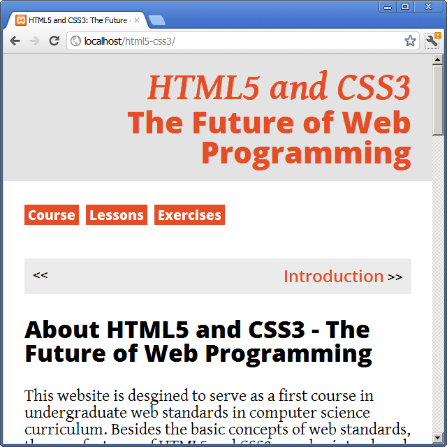
This website uses a responsive design to adapt the layout to the viewing environment of the user. You can test it by changing the size of the window of the browser:
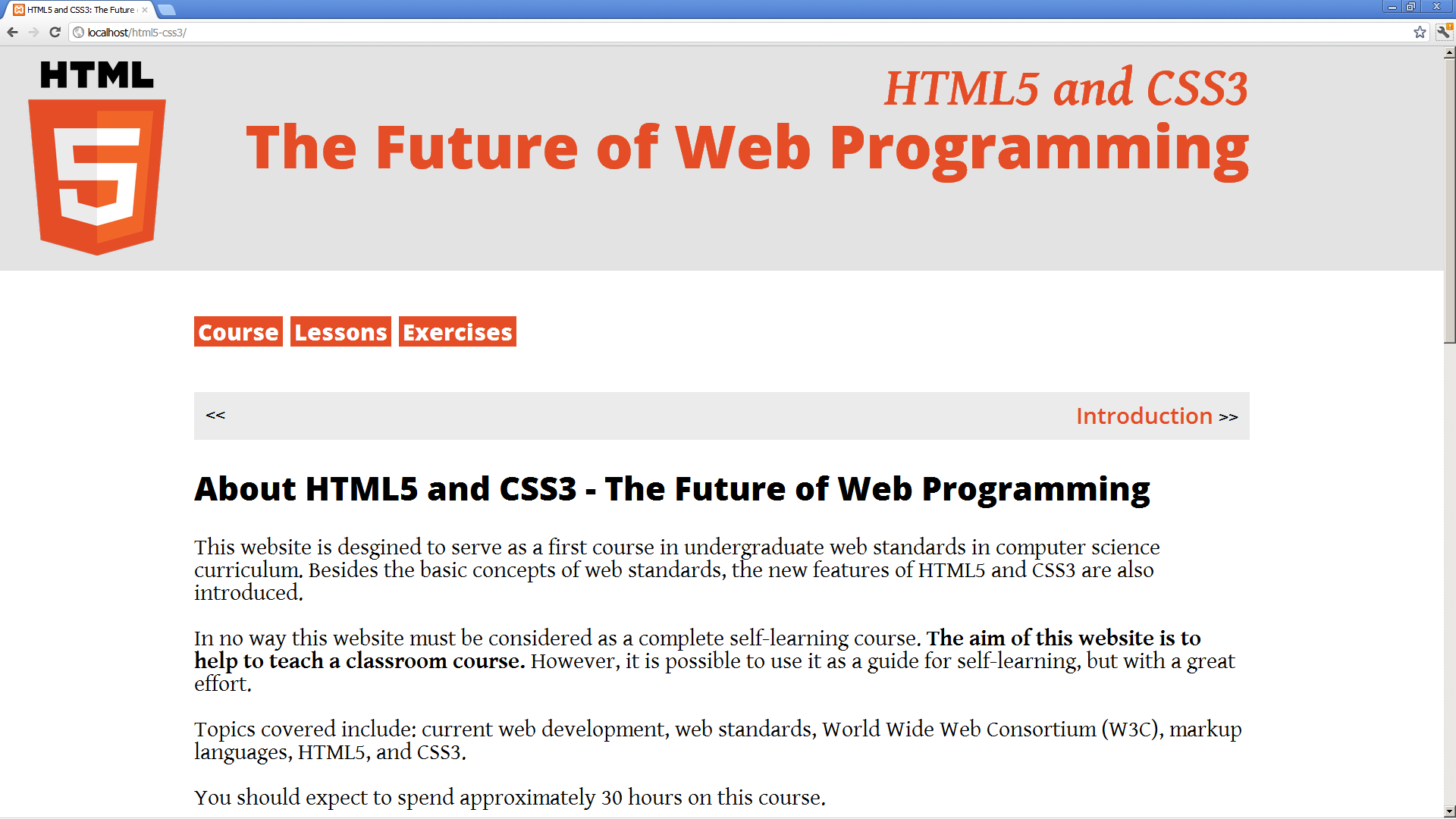
1920 pixels:
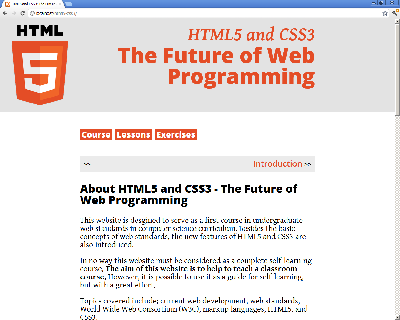
1280 pixels:
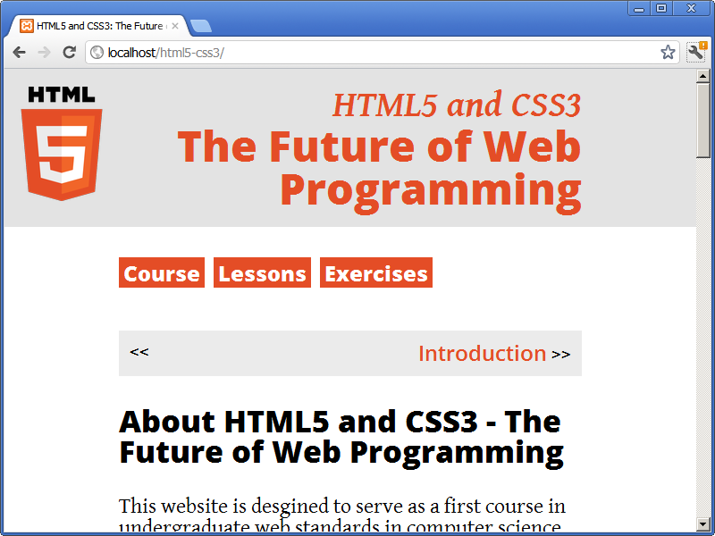
800 pixels:
640 pixels:
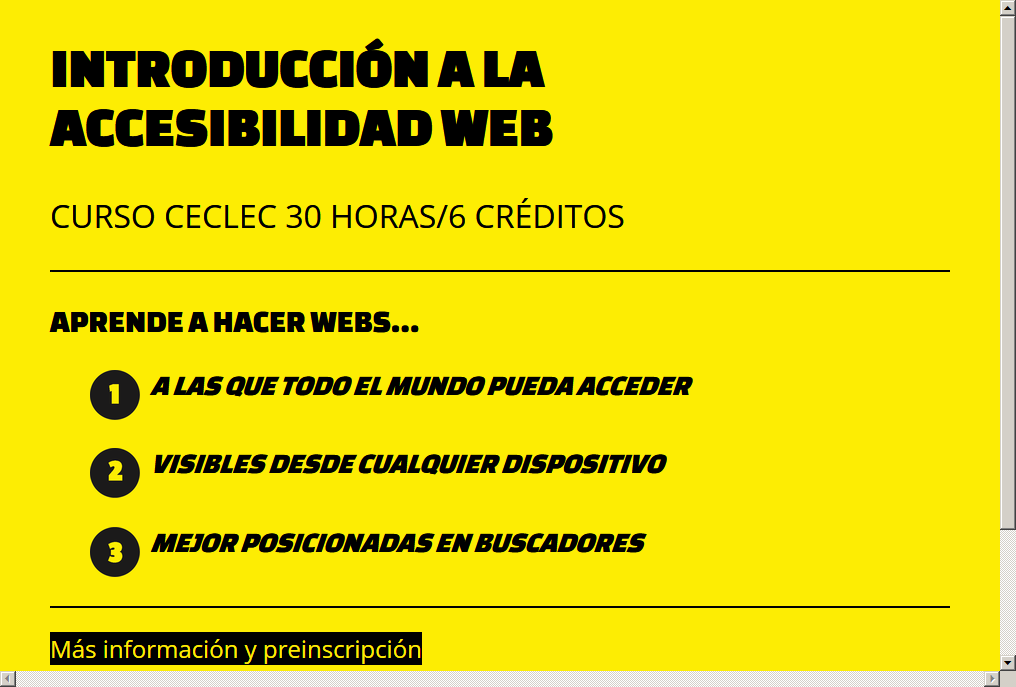
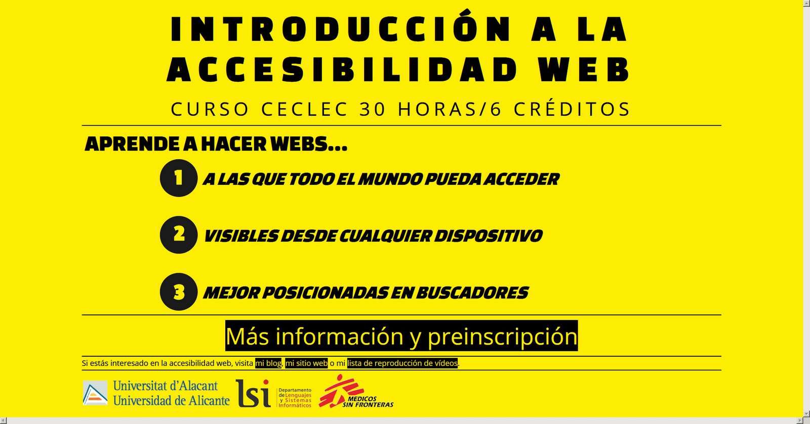
Another example of responsive web design, Introducción a la accesibilidad web:
More than 1600 horizontal pixels:
Between 1025 and 1600 horizontal pixels:

Until 1024 horizontal pixels: