33 Responsive Design
According to the Wikipedia, responsive web design...
...indicates that a web site is crafted to use W3C CSS3 media queries with fluid proportion-based grids, to adapt the layout to the viewing environment, and probably also flexible images. As a result, users across a broad range of devices and browsers will have access to a single source of content, laid out so as to be easy to read and navigate with a minimum of resizing, panning and scrolling.
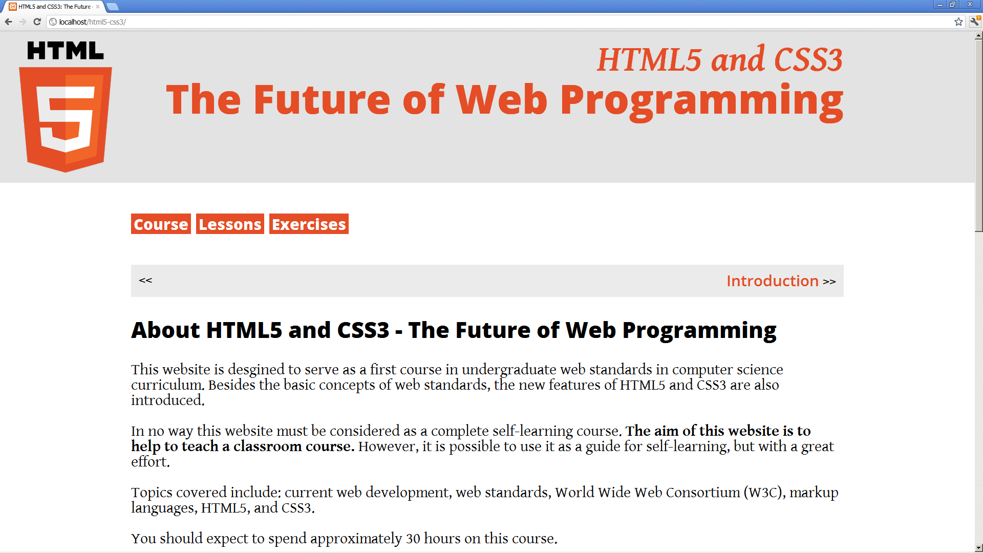
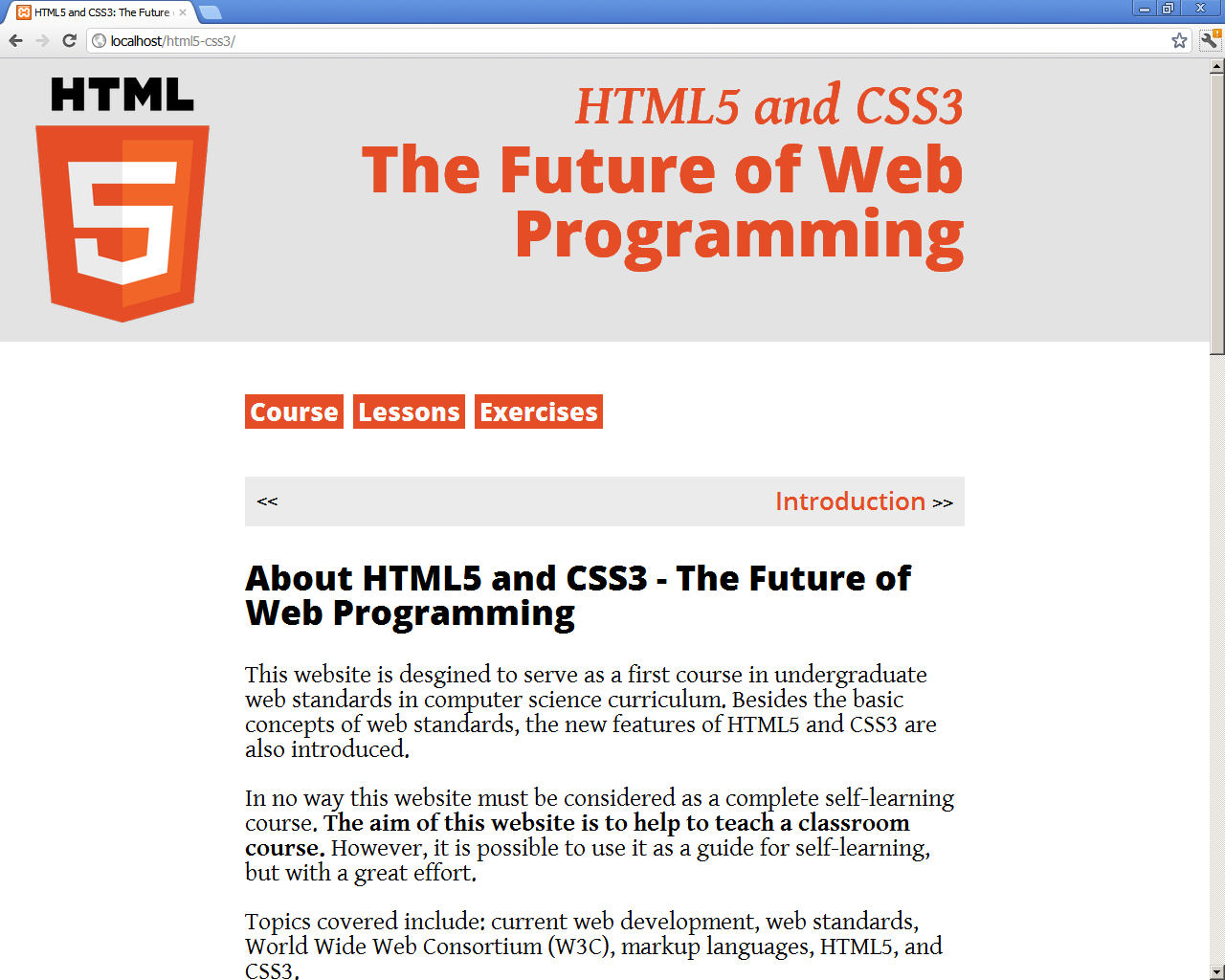
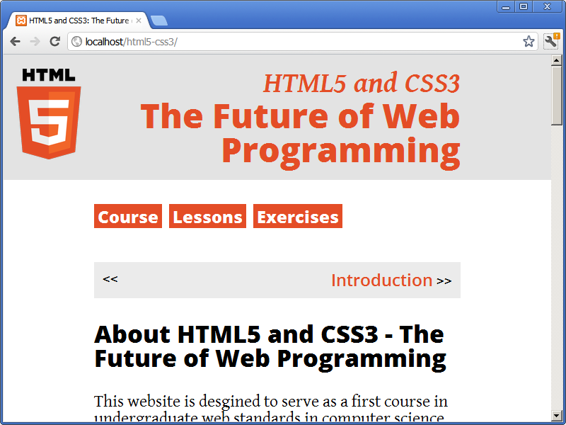
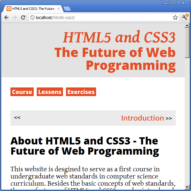
The website HTML5 and CSS3: The Future of Web Programming is an example of responsive web design used to adapt the layout to the viewing environment of the user. The responsive web design can be tested by changing the size of the window of the browser:
1920 pixels:
1280 pixels:
800 pixels:
640 pixels:
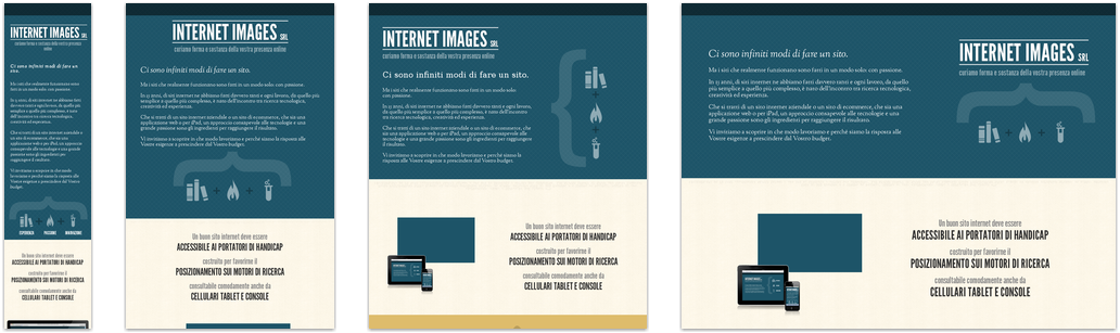
The website Media Queries offers a collection of inspirational websites using media queries and responsive web design. For example, in the following image, we can see diferent layout versions of the website Internet Images: